While the designs for the 3" CDs were usually the product of weeks of labor…
…the catalogue cards were always conceived and executed an hour or two at the very last moment, tossed off as jokes to take advantage of unused space on the printing press.
A remnant on The Flight of Everson K print run. Note the historic, Sweden-based URL. The cause of confusion for years to come. The label Minty Fresh once sent an email: “I just checked your web site and never before realized all the great bands you have. Please let me know what is available for licensing in North America.”
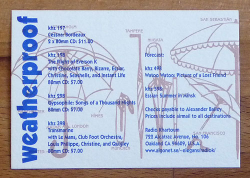
From the Songs of a Thousand Nights print run. The cities in the diagram represented correspondents.
Why do so many German items turn up in the vintage clothing shops here?
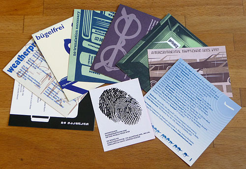
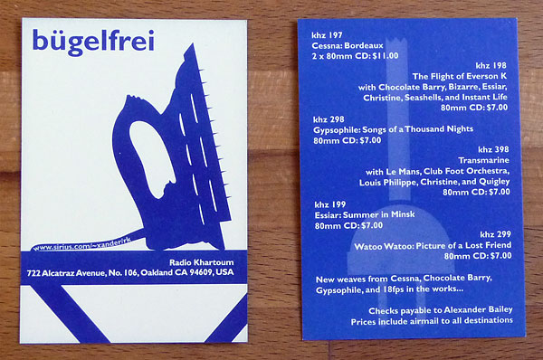
Bügelfrei translates as “iron free” and is the equivalent of “sta-prest” or “permanent press.” I wondered what “sta-prest” or iron-free music would mean. Not necessarily a good thing… Hence the clothing-unfriendly nod to Man Ray. From the Summer in Minsk print run.
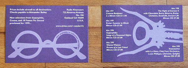
Rosé colored glasses from the Picture of a Lost Friend job.
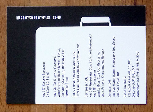
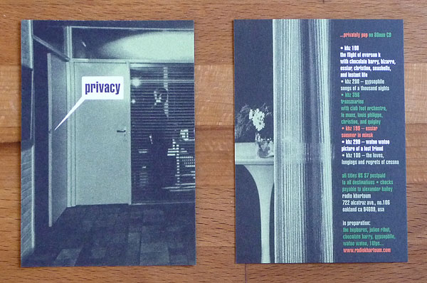
From the Loves, Regrets and Longings of Cessna run: “…privately pop on 80mm CD.” What did it mean? Obviously I had pulled an all-nighter to finish the album artwork.
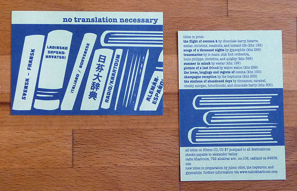
Hyping the international character of the RK roster. We usually had three copies of a sleeve on a press sheet and four inserts. In this case, there was an alternate version of the insert made which substituted “Français - Suédois” on the first dictionary. From the Champagne Reception sheets.
From The Stations of Abandoned Days run, the “intercontinental trafficking” card was never distributed due to Julien Ribot and his debut album being poached away. I did, however, cannibalize the design for use as a personal card.

This one, printed with the Double Life of Testbild! posters, recycled an unused design for De loin, les choses.
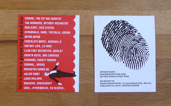
“Let’s have a great big hand for…” was sneaked in on someone else’s print run. The thumb print, would indeed, belong to a giant thumb.